Some politicos tell me campaign signs are useless. Others tell me they’re a useful part of the overall strategy. Either way, they continue to fascinate me.
City Council, At-Large
Khrystian King
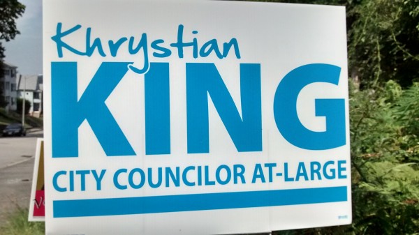
Most political advertising is pretty conservative. King’s sign starts in a conservative place, with large, sans-serif lettering. Two tweaks add a little style: his first name looks handwritten, and the color is not the navy blue you’d expect, but something a bit lighter. The thick line across the bottom grounds it, but otherwise it’s pretty free and open, not cramped or complicated. This is a sign for a candidate who wants to try new things but cautiously, not as a radical.
William S. Coleman III
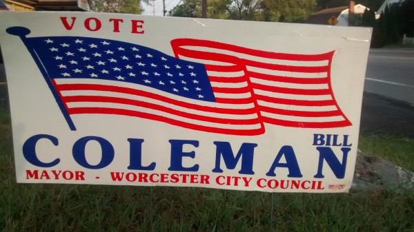
I have seen very few of these traditional Bill Coleman flags this year. At one time Bill was best known for getting giant American flags painted on fences and other public places, so in his case the flag is not just a symbol of America, but part of his brand. The distorted aspect ratio of the flag drives me crazy. I know that people are happy to watch things in the wrong aspect ratio, and that most people would rather see a 4:3 image stretched to 16:9 if that’s what it takes to fill the whole screen. But I don’t think people care about “filling the whole yard sign,” and anyway, you are designing your own sign to your own specifications. You can add a flag in the correct aspect ratio and then move the elements around to make something nice.
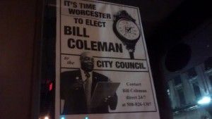
These are the Coleman signs I’m seeing this year, mostly displayed in store windows. Normally I wouldn’t want this much info on a sign, but the store window signs are going to be seen by pedestrians, who are close enough to read all the text. The clock and the photo of Bill are great. Him including his personal phone number makes it memorable.
Linda Parham

We’ve seen candidate photos on signs for a few years now, but this year it’s become a real trend. This is a nice photo of her. I guess the takeaway here could be, “She’s black” (a rarity among Worcester politicians and candidates), “She looks like a nice lady” (not that rare or still noticeable), or “I remember when I met her.” This is basically a nice sign, mostly because of the photo and the tasteful layout. The colors and fonts are a little off-putting, though. There are 4 fonts, which is way too many for something this simple. And the color combination, while not ugly, is weird enough to attract comment. Sometimes when a sign like this has weird colors, it’s because the designer grabbed the color of the person’s skin or something they are wearing. That doesn’t look to be true in this case. The pink is fine, but I don’t know why it’s paired with this shade of brown, or even what to call this shade of brown. Dijon mustard? One color website describes it as “dark moderate orange,” which doesn’t seem accurate. Next election, I’d like to see what they could come up with if they took “Vote” off the sign and used another color combo.
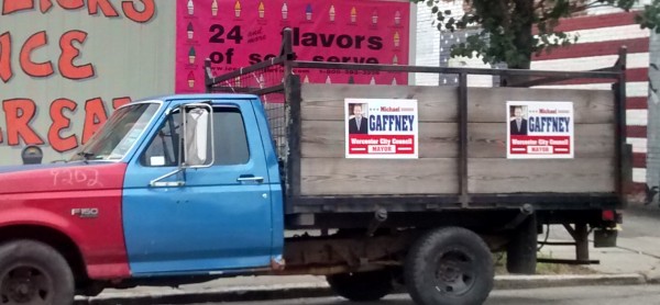
Michael Gaffney
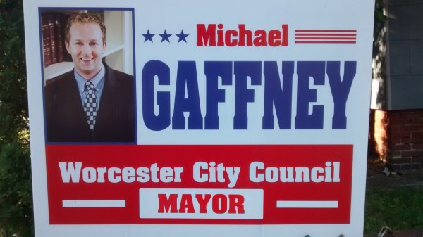
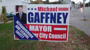
Mike Gaffney’s sign used a photo of him last election, and here it is again. In his case, this is a photo he uses in his legal ads on the back of phone books, so it’s very appropriate: “I’ve seen this guy somewhere before.” When he runs for state senate or something, I would like to see him switch things up and use a photo that says something closer to his brand: “Strong Maverick” rather than “Affable.” And I’d like to see him not wear a button-down collar with a suit. There’s a lot going on here but he only uses a couple of fonts and the red, white, and blue combo is classic. I like how the sign suggests a flag with the stars and lines, but doesn’t have an actual flag—that would mean 2 pictures on the same sign, which wouldn’t pair well with the classicism.
A couple weeks before election day, about half the Gaffney signs started sporting stickers, as below. Nobody expects this sort of thing with campaign signs, so it grabbed another round of attention from anyone who’d stopped paying attention to these signs. And it sold the core of the campaign in four words: “Neighborhood And School Safety.” It makes the signs more cluttered, and harder to navigate for anyone seeing them for the first time, but I can see why the tradeoff is worth it.
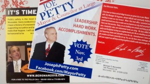
A lot of innovations from the Gaffney campaign this year. Below are some standard, mailed campaign flyers.
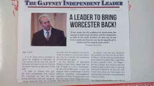
And below is what Gaffney mailed out, a mini newspaper.
Again, we could quibble with the details. The font should have been serifed, the text auto-hyphenated, and the font-size-to-column-width ratio adjusted. Those would have made it easier to read and doubled the “newspaper” vibe. But for the purposes of grabbing a voter’s attention and convincing that voter that this candidate had thought through the issue, this is just next-level stuff.
The only thing comparable was Khrystian King’s mailer, chock full of visual references to the 21st century.
Gmail, an iPhone. Nice way to reference Jordan Levy’s unofficial candidate endorsement.
I’m hoping two years from now, a candidate sends out a mailer consisting entirely of emojis.
I didn’t spend much time on broadcast media this summer, so it turns out the only candidate ad I saw (or at least that I can recall) was King’s Facebook ad:

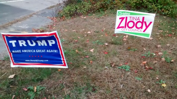
Christina Zlody
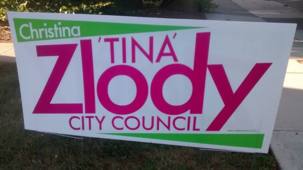
I really like this sign. Both the color combo and the design are non-traditional, which for someone running as the “arts candidate” is just right. It’s also just right for a candidate with the last name “Zlody.” Listen, you’re never going to have a staid sign with a giant “Zlody” on it, so don’t even try. Everybody calls her Tina, but she’s registered to vote as “Christina,” so that’s what’s on the ballot. The sign does a good job of communicating this without making “Christina” a major element and confusing people.
Kate Toomey
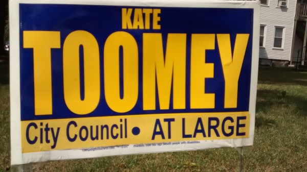
This color combination always reminds me of the Lakers, though her blue is both darker and less purple. These signs also remind me of bright sunshine overcoming a dark night. Very on-brand for Kate.
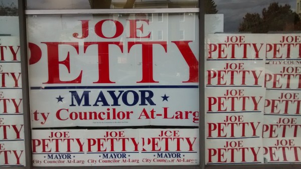
Joe Petty
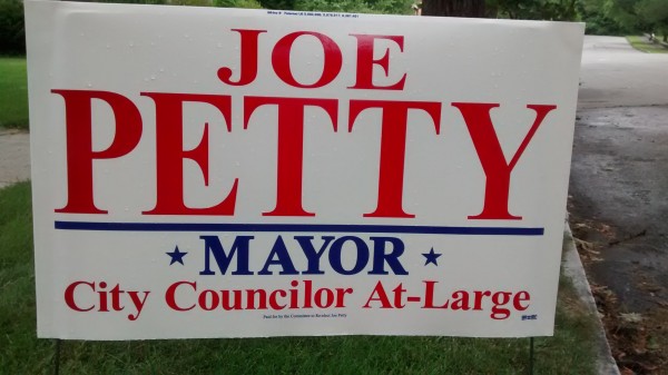
This sign is neutral-edging-into-bad. The line doesn’t add anything and makes the sign harder to parse. I always like white space, but the tall, serifed “PETTY” has a lot of whitespace within the word itself, which I don’t like. I’d like to see him move that line (and maybe those stars) to the bottom of the sign and fatten up the “PETTY.”
Juan Gomez

This is a memorable sign and I think it works. The stencil splits the difference between “traditional screenprinted sign” and “modern sign with high-res photos.” I think the image of Juan looks energetic but not radical. The outside box helps you navigate the many elements on this sign. Most of the sign seems to be the same typeface in different weights and widths, and the sans-serif typeface is reserved for a small line at the bottom. This is the sign people are talking about. (Interesting that his slogan is “Together We Will” and Linda Parham’s is “Better Together.” Are these statements in reaction to this divisive year of Worcester politics?)
Konnie Lukes
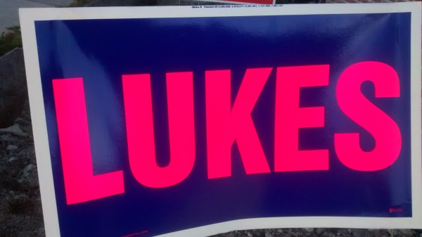
That navy and hot pink combo says this candidate is strong, sober, and feminine. You may think the slightly-odd color combo is because of Konnie’s noted iconoclasm; I think it’s because of her noted disinterest in unimportant details. Either way, I see so much Lukes in this sign.
Carmen Carmona
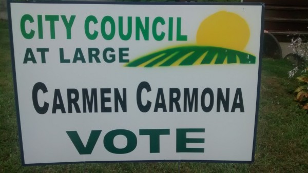
The fuzziness of the sunrise looks like it was spraypainted on with stencils—and after running my hand over the sign I think it was! This is a really old-school, handmade sign. The layout is awkward and I don’t like all the different font widths. I would like to see this sign looking even a bit more homespun, which would make the awkwardness work for it, not against it.
Morris Bergman
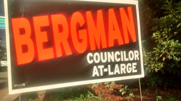
This sign says “Halloween,” which is a little goofy in September, but is perfect for the general election in early November. The diagonal “BERGMAN” adds a little energy to this very traditional sign. Mo told me it was inspired by a Kennedy/Johnson sign, perhaps the one below.

Philip P. Palmieri
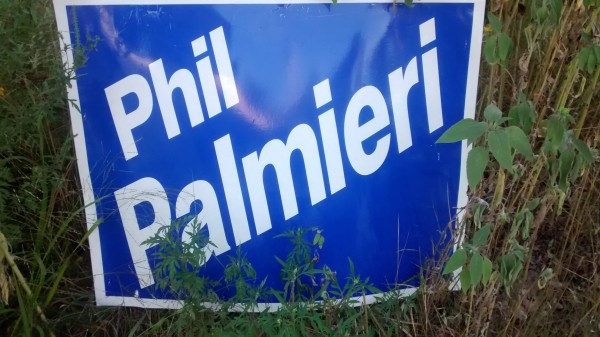
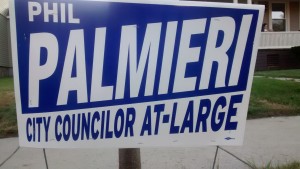
Bizarro Worcester pointed out that the diagonals of this sign are like the off-kilter “Dutch angle” movies use “to portray psychological uneasiness or tension.” Signs like Bergman’s and Zlody’s have diagonal elements, but with a minimum of stretching letters. Palmieri’s sign exaggerates the diagonals, to the point where I think it hurts both readability and aesthetics. On the other hand, he’s won several district elections with these signs, so there’s something to be said for maintaining the Palmieri look when running at-large.
Matthew Wally

Here’s another really traditional sign—it uses only words and lines. “WALLY” is readable, nobody else is using a lot of green this year, and the script “for” is small enough to keep from distracting us.
Robert Sargent
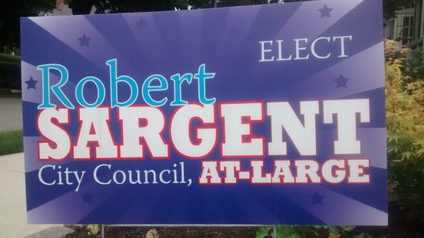
You would think you’d have to be pretty witless to not see the “SARGE AT LARGE” highlighted on this sign. I am one such witless person. Maybe if you first see it from exactly the wrong distance, all you see is “there is inconsistent outlining on SARGENT” and then it’s hard to see it any other way.
I’m not sure I like this sign, but I wouldn’t blame you if you did. “SARGENT” and “AT-LARGE” look like they were taken from a very traditional sign. The funky font used for the other words, and the gradients, do not. These colors remind me of otter pops, a good image for the prelim election in early September, but maybe the wrong image for the general election in early November. And sheesh, really, those gradients. I like it when people shake up the staid visuals of political ads, but maybe we should not head any further down this particular road guys.
That said, I’d like to see more signs with fresh designs like this. The SARGE AT LARGE reminds me of visual jokes like the arrow in the Fedex logo. Whatever the election results, I hope he runs again, and does another round of experimenting with sign design.

City Council, District 1
Tony Economou
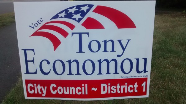
This is another sign that gives me a weird vibe which I then try to find reasons for. The simplified flag is just not good. Is he taking shelter under it? Is his name blocking it from being fully unfurled? Neither of these is a good implication. Maybe clean up the stripes at left so they are not joined on one edge, and run the stripes at right all the way to the blue field. Get rid of the little “Vote” for sure.
Cindy Nguyen
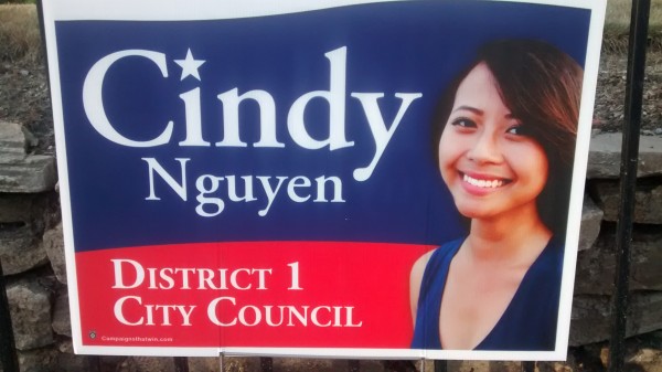
Here is another photo sign. What is our takeaway from this photo? “Young, pretty, and happy.” I think it’s good that her outfit continues the red, white, and blue theme. The subtle wave of the background elements takes a very traditional style and adds some energy. The star over the “i” fits the flag theme and connects to the youth of the photo.
City Council, District 2
Jennithan Cortés
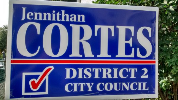
Another sign in the traditional mold. The checkbox is a nice alternative to a star or flag, and a much better alternative to the word “Vote.” This sign has a lot in common with Joe Petty’s, but this one does it right.
Larry R. Shetler
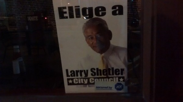
This window sign is the only Shetler sign I’ve seen. Overall it’s good. The photo communicates that he’s a Latino (in contrast with his last name), that he’s older (or at least has white hair), and that he’s happy. I think I’d have him wear a light blue shirt to contrast a bit with the background.
Candy Mero-Carlson

One font, one star, a fun capital “C,” and an echo of Coca-Cola. All in a traditional sign. This kind of reminds me of a logo for a tee-ball team in the 70s. I have only good associations with this sign.
City Council, District 4
Sarai Rivera
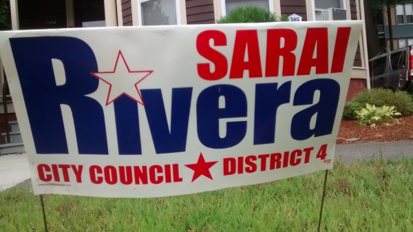
Red, white, and blue. Extremely readable. A couple stars to add slight visual interest. I like the wit of the lower star seeming to have been cut out of the upper one. This sign is really growing on me.
Jacqueline Kostas
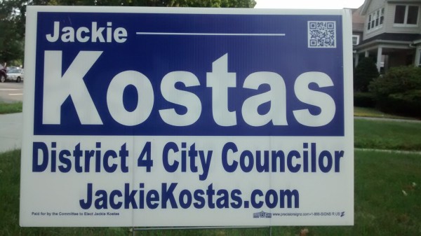
You should like this one because it’s an elegant traditional sign and very legible. I hate this sign because it contains a QR code, my enemy. Quick Response codes, as we usually encounter them, and useless and ugly. This one is useless, ugly, and perplexing. How are we supposed to interact with this? Wander onto some guy’s lawn? (Says the guy who evidently wandered onto a couple dozen lawns so far this election season.) Spoiler alert: the code will take you, like it says on the sign, to JackieKostas.com.
City Council, District 5
Gary Rosen
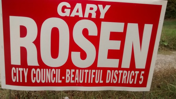
Gary Rosen remains a joyfully goofy part of Worcester politics. Even though he’s running unopposed he’s still out there standing on streetcorners, waving and smiling. And he has a brand-new campaign sign, with a brand new slogan, his personal catchphrase “Beautiful District 5.” There is nothing I can say here, no way I can obsess more over the details than he does.
School Committee
Tracy Novick
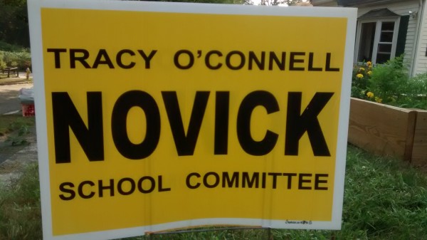
I like Tracy Novick, and I like her sign. It has all the legibility benefits of a highway sign, while being a little less pushy. And it reminds us, somewhere in the back of our brains, of a school bus. You could redo this sign to be more sophisticated, but in this case I think simple is just right.
John Monfredo
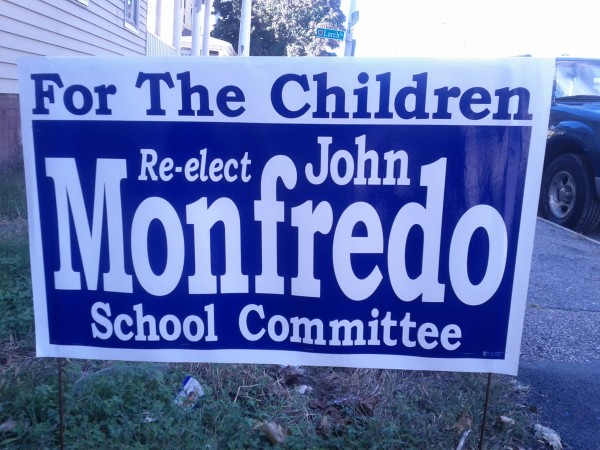
Very readable. I think a designer could work wonders with another 20 minutes on this sign, reducing the sense of crowding and clutter. But still, that slogan “For The Children” continues to irritate me. Maybe because “playing the for-the-children card” just feels more creepy and patronizing than “playing the puffery card” (Rosen) or “playing the unity card” (Parham).
Cotey Collins
This is the one sign I have seen that I haven’t had the chance to photograph. Google Image Search isn’t helping me find it. Anyone want to email it to me?
Jack Foley

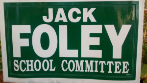
This remains a totally OK sign. The dark green is not a color I love, but I can’t object to it. Would it be a little better without the border?
Maybe a little. Not a big deal either way.
Hilda Ramirez

Another diagonal sign that refrains from over-distorting the letters. Red, white, and blue. The sign as a whole reminds me of a flag.
Molly McCullough
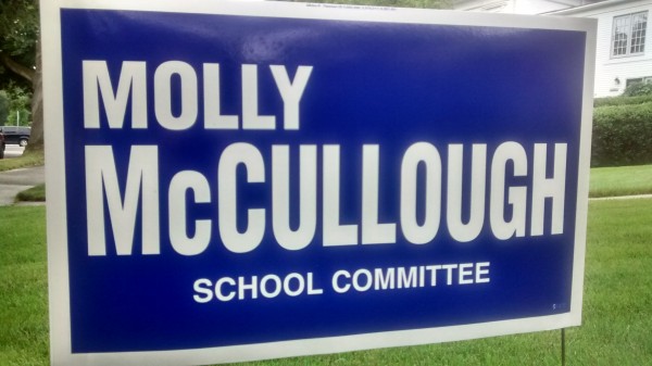
About as plain a sign as you can get.
Dianna Biancheria
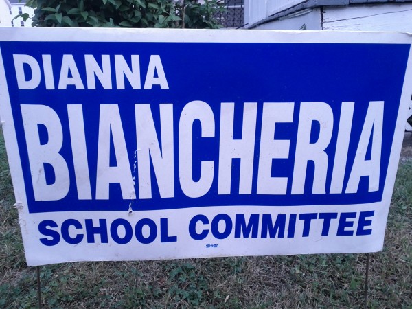
Another really stripped-down School Committee sign. So close to the McCullough sign, above. Honestly I think the McCullough sign has the edge. No need for the last name to be so compressed—just make the font smaller, it’l be even more readable than a larger but narrower version. And the white bit at the bottom adds minimal interest to a sign whose strength is simplicity—an even blue field works just fine. It would be great if a couple allied candidates use the same templates for their signs and other campaign materials. They could put across the message “We are a ticket” in an otherwise nonpartisan election.
Nicola D’Andrea
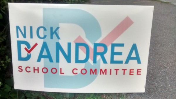
I love this sign. It’s not traditional at all. I love the colors, I like the font, I love the repetition of the D![]() . Substituting a checkmark for the apostrophe is maybe too clever, but I don’t care, here I think it works. If the big trend this election is “photos,” this sign and Zlody’s make “fresh and professional” a minor trend of its own.
. Substituting a checkmark for the apostrophe is maybe too clever, but I don’t care, here I think it works. If the big trend this election is “photos,” this sign and Zlody’s make “fresh and professional” a minor trend of its own.
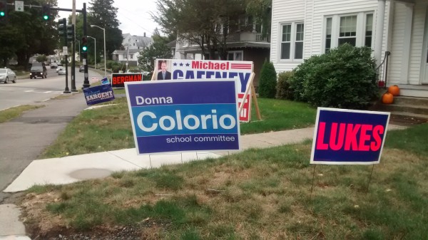
Donna Colorio

The name starts with “Color,” and these two shades of blue make a very nice color combo. My brain also wants to associate this with “cool,” both in temperature and style. This is just such a nice, simple design. Any campaign with a below-average sign should just take an hour and copy this and immediately surge to near the front of the pack.
I want to say, in postscript, that I sincerely appreciate the work it takes to run a campaign, and the work it takes to fulfill the duties of public office. Thanks to everyone for making this election happen.
See also:


Looks to me like the Sargent outline change is to highlight “Sarge at Large” – but it’s not strong enough to make it noticable.
Neil, now that you point it out, I can’t help but see it. File under “definitely too clever.”
You are not counting the stars?
Thanks for the comments on my sign. I definitely was looking for different and I did design it myself. I also designed the Khrystian King sign, it is a deviation from his State Rep run a few years back. I loved this article.